
")
It’s no secret that getting through the résumé sift is the biggest hurdle of the job search marathon. Indeed, in a competitive market where vacancies can attract huge numbers of applications, simply making it to the interview stage can be an achievement in itself.
So, how do you fend off the competition and stand out from the crowd?
One way is by submitting an eye-catching, esthetically pleasing résumé, otherwise known as an infographic résumé. Ever since student journalist Chris Spurlock took the internet (and his former employers at HuffPost) by storm in 2011, the credibility and success of visual résumés are undeniable.
And the good news is that you don’t have to be a professional designer to create your own, either! In this article, we’ll discuss the different ways you can craft an impactful infographic résumé, as well as when it’s appropriate to use one and what things to look out for.
What is an infographic résumé?
Let’s start by defining what in infographic is! In simple terms, it’s a visual representation of data and information. When done right, infographics can turn big bundles of information into easily digestible bits, making them more interesting to look at in the process.
An infographic résumé then does the same: it takes the details of your educational and professional backgrounds and conveys them through visual or graphical representations.
Who should use an infographic résumé?
Infographic résumés are best reserved for people looking for work in a creative industry. If you’re after a graphic designer position or, even better, a data visualization specialist role, then an infographic résumé won’t just help you stand out, but it will also showcase your technical skills and creative ability.
However, it’s best to only submit an infographic résumé when you’re contacting the hiring manager directly (ie: by email); otherwise, an applicant tracking system will probably try — and fail — to scan your document. That’s because ATSs are built to “read” text-based documents and can’t interpret design elements.
Finally, it’s a good idea to submit a traditional résumé as well, just in case your potential recruiter isn’t a fan of the infographic format.
Where to create an infographic résumé
If you’re a design whiz, we trust that you know your tools, so feel free to skip this section! (You don’t need us recommending Adobe Illustrator or InDesign to you.)
If design is not your specialization, however, but you’re still after a position in a creative industry, read on: we’ll share some tools and platforms you can use to make the infographic résumé creation more straightforward.
CareerAddict
Our team offers a selection of professional and unique infographic templates for you to easily download and utilize, each created in-house by our résumé experts.
Canva
Though many designers dislike Canva (possibly as much as they oppose Comic Sans), it’s a perfectly decent tool for non-designers. There are countless free and paid templates to browse and customize, including ones for infographic résumés.
Piktochart
Noted for its intuitive and user-friendly drag-and-drop method, Piktochart offers a free account plan with limited features. Opting for the Pro option at $14 per month, though, will give you access to an enormous library of templates, logos, symbols, icons and shapes.
Gliffy
Gliffy is another tool that focuses specifically on the design of flowcharts and diagrams. These can be particularly handy if you’re building a timeline or seeking to visualize something chronological. It costs $8 a month to maintain a personal account.
10 tips for creating an infographic résumé
Whether you’re customizing a ready-made template or crafting your résumé from scratch, there are some things you should bear in mind to ensure that the result is as eye-catching and impactful as can be.
1. Make sure it’s appropriate
Before you get to work on your design, you should first consider if an infographic résumé is the right course of action to take.
For example, if you’re applying for a job in graphic design or technology, where you’ll be expected to demonstrate some creative flair or convey complex information in a simple and accessible way, then an infographic résumé is a perfect idea.
Conversely, if you’re putting yourself forward for a role in law or corporate finance, then there’s a good chance that a more traditional, text-based résumé will be more appropriate.
The key is to do some company research on your target employer, and determine whether a bolder, more modern approach will work in your favor or see your entry end up on the cutting floor.
2. Don’t forget the basic principles
Although it will look radically different, your résumé should still adhere to the same principles that a basic, black-and-white document would. This means refraining from following a general, one-size-fits-all approach, and instead tailoring your résumé specifically to each company and position.
Similarly, just because the emphasis is more on the visual, this isn’t an excuse to overlook poor grammar and spelling; mistakes are still mistakes, after all, no matter how shiny and esthetically appealing they look.
3. Don’t copy your existing résumé
This doesn’t mean you should take everything from your original résumé as is, though. In fact, you should totally avoid copying your existing text, as the longer sentences and paragraphs will not lend themselves to the short, punchy nature of the infographic format.
You’ll also likely need to perform some culling in order to make everything fit — this means finding and removing any surplus information that offers no value to your application.
4. Make a sketch of the layout
Before you get started with designing, it’s a good idea to first write down everything that you want to include and then lay it out crudely on paper.
All professional designers use this process to review any major design concerns before committing to the process, and it will give you a foundation on which to building — specifically, which sections will appear where on the page.
5. Choose your style
If you’re applying for an illustrator role, then letting your personal illustration style shine through is an excellent idea. If, however, you’re applying for another creative role (like digital marketer) and design is not your expertise, it’s best to stick to a clean, professional style and avoid visuals that remind the viewer of free stock cartoon images.
Looking at examples of infographic résumés online can help you identify the visual personality that best matches your professional identity.
6. Adhere to the rules of design
If you’re design-savvy (whether as a professional or simply as a Photoshop enthusiast), then you’ll be aware of the principles of design, such as:
Color
Color can have a huge impact on the subconscious mind, with poor combinations of shades and hues turning us off, and more pleasant patterns reeling us in.
The colors themselves can say a lot as well; for example, it’s a well-worn design precept that red suggests boldness and adventure, while green inspires trust and loyalty. Use the right colors to convey your personal brand.
White space
Trying to keep things simple when you’re conveying an awful lot of information on one page can be tricky, but not impossible; there are several infographic résumé examples that have maintained this balancing act perfectly.
Try not to bombard the reader with too many graphics and pieces of text in such a small space, and try to make the theme consistent throughout, utilizing blank spaces as necessary.
Flow
Ideally, you want your résumé to flow logically; this doesn’t necessarily mean that your name and contact details have to be at the top, for example, but they should certainly be clearly distinguishable from your other sections.
Remember: recruiters don’t spend long looking at résumés — even shiny, colorful ones. And if they have to struggle to get their bearings first, then they’ll likely just give up.
Fonts
Different fonts can convey different things. You know how certain typefaces, like Perpetua, make you think of old classics gathering dust in a library, while others, like Playbill, make you think of Western wanted posters?
You’ll want to ensure that your typefaces of choice are readable and complementary, ideally limiting them to two in total for the entire document.
7. Don’t leave out anything important
Once you’ve settled on an actual design, you need to ensure your résumé contains all the important details. For the most part, these will be the same as with a traditional résumé, although the nature of the format allows you to be slightly more creative.
Ensure your document includes:
An attention-grabbing header
With so much activity going on, your name and “introduction” should be a lot more prominent. In fact, it should stand out completely from anything else on the page. Consider a larger text size or a more imposing font type.
Your contact details
As previously mentioned, infographics are relatively limited in the information that they convey, and so it’s a wise idea to provide links to your LinkedIn profile or to an external online portfolio.
You can also provide links to your other social media profiles, utilizing their logo icons to play on that brand credibility and get creative.
Your education and work experience
Many infographic résumés feature education and work experience on a timeline (or a variant of a timeline); this makes things logical and easy to digest for your recruiter.
It’s also a good idea when listing previous employers to use their logos; people respond naturally to brands, and it adds a further degree of professionalism to your design.
Your skills and strengths
The skills section lends itself well to an infographic résumé, as you can visually assign a particular level of expertise to a certain skill. For example, rather than simply saying that you’re competent in Java, PHP and Python, you can instead use horizontal bar charts, with your proficiency level in each language given a score out of 100.
8. Use numbers
Much like with traditional résumés, you’ll want to include quantifiable achievements on an infographic résumé. Using numbers (as in digits) will not only save you precious space as opposed to typing out values and dates, but it will also help the hiring manager digest your content more easily.
Better yet, you can use charts (like bar charts, Sankey diagrams, scatter plots and sunburst charts) to visualize your skills and achievements.
Whatever you do, just aim to keep your visuals as uncomplicated and to-the-point as possible.
9. Get feedback before you hit “Send”
Once you’ve finished your design and you’ve included everything that is relevant, it’s a good idea to show the final version to some friends or relatives (especially if they have a design background).
If you’re getting the same kind of comments (eg: “the colors don’t match”, “the fonts are too small”, etc), then it’s generally a sign that recruiters are going to feel the same way. Take these comments on board, go back and tweak whatever needs to be fixed, and then seek another opinion.
It’s also good practice to ask them to proofread your résumé, too, as multiple pairs of eyes will be far more likely to pick up on any silly spelling mistakes or grammatical errors that you may have overlooked.
10. Make sure it’s formatted correctly
Recruiters tend to print out the résumés of candidates that they intend to interview; therefore, ensure that your design is formatted to fit an A4/letter-size page, with breaks inserted at the necessary points, should your infographic extend further than one page.
This may sound like a minor detail, but it makes life a lot easier for your potential employers, which, in turn, will make life easier for you!
Remember: your prospective employer likely won’t have an A3 printer in their office; and if the information of your document shrinks too much on A4, it can become unreadable. So, optimizing for the right size and printing out a copy of your own before applying is imperative.
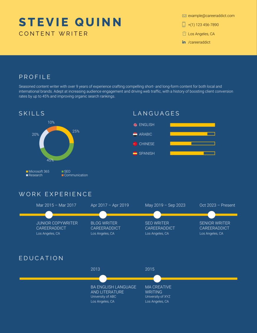
Example infographic résumé
Now that we’ve discussed the best practices of putting together an infographic résumé, let’s put all that together and look at an actual example.
Final thoughts
As you can see, producing an attractive, high-quality infographic résumé doesn’t necessarily need to be difficult, nor does it need to be restricted to professional designers.
Indeed, with the right amount of research, inspiration and content, anybody can set themselves apart from the competition, helping to secure that dream job they’ve always wanted in the process.
We hope our infographic résumé guide has been helpful! If you have any more questions for us on how to create an infographic CV (or any other résumé writing-related question), leave us a comment below!
This article is a partial update of an earlier version originally published on July 9, 2018.