

Defining text-based art is trickier than it seems. Yes, it is art with text, but… Are images optional, required, or verboten? Must the text be language or will arrays of aesthetically placed but linguistically random letters count? Can advertising (e.g., Milton Glaser) or religious art (e.g., Islamic calligraphy) be considered text-based art?
Is there a single definition of text art? Can there be? Should there be?
For the sake of this brief guide, we will limit ourselves to 20th and 21st century artists, primarily ones working in English, since that is more than enough to get acquainted with the topic. We will also use the following working definition to narrow our scope:
Text-based art is an art form where language elements play a pivotal role in the composition. It can be purely linguistic or combined with images or physical objects. It art engages viewers by stimulating their minds and hearts, encouraging them to explore new interpretations and emotional responses to the work. By blending visual, physical, literary, and poetic elements, text art creates a rich, interdisciplinary experience that broadens the scope of traditional art forms.
There are plenty of fascinating and delightful near-cousins to text-based art that you can follow this with, including concrete poetry, visual poetry, much of the Fluxus output, and conceptual writing. Those, alas, are for another day.
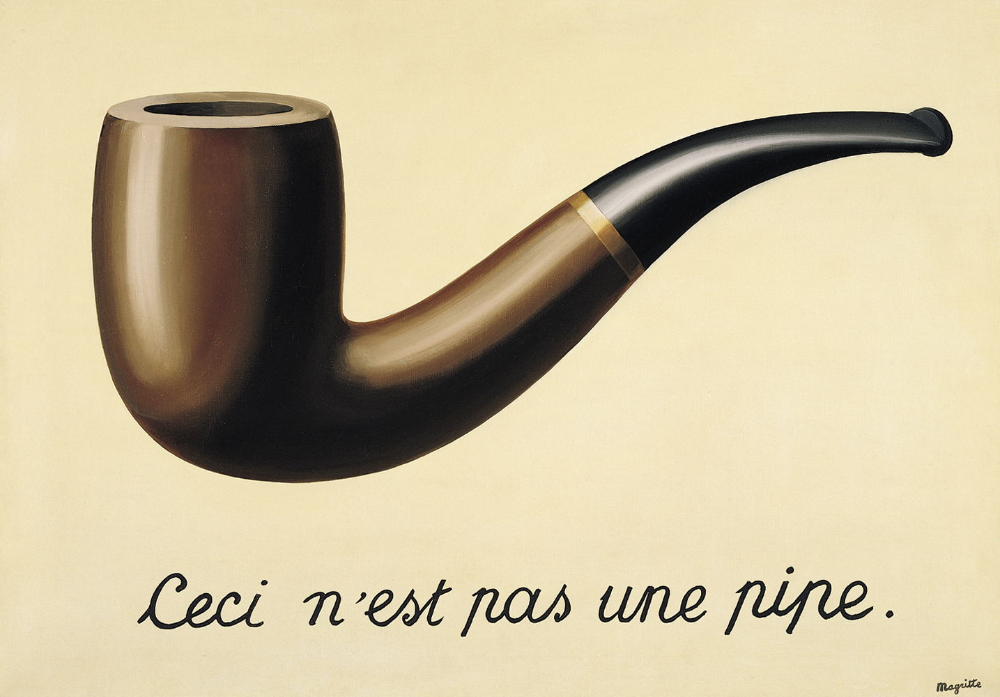
René Magritte
René Magritte’s famous painting, The Treachery of Images, is one of the earliest and most famous examples of art leaning toward being text-based. Georges Braque likewise incorporated text into his work with newspaper clipping and other printed materials.
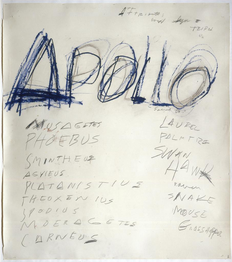
Cy Twombly
Cy Twombly, in his frenetic sketchings, perhaps made the biggest strides toward a text-based art with works like Apollo (below), which played with text in a way that would be taken to a further extreme half a century later by Jean-Michel Basquiat.
But it wasn’t until the 1960s, with the arrival of several key figures on the American art scene, that text-based art came into its own.
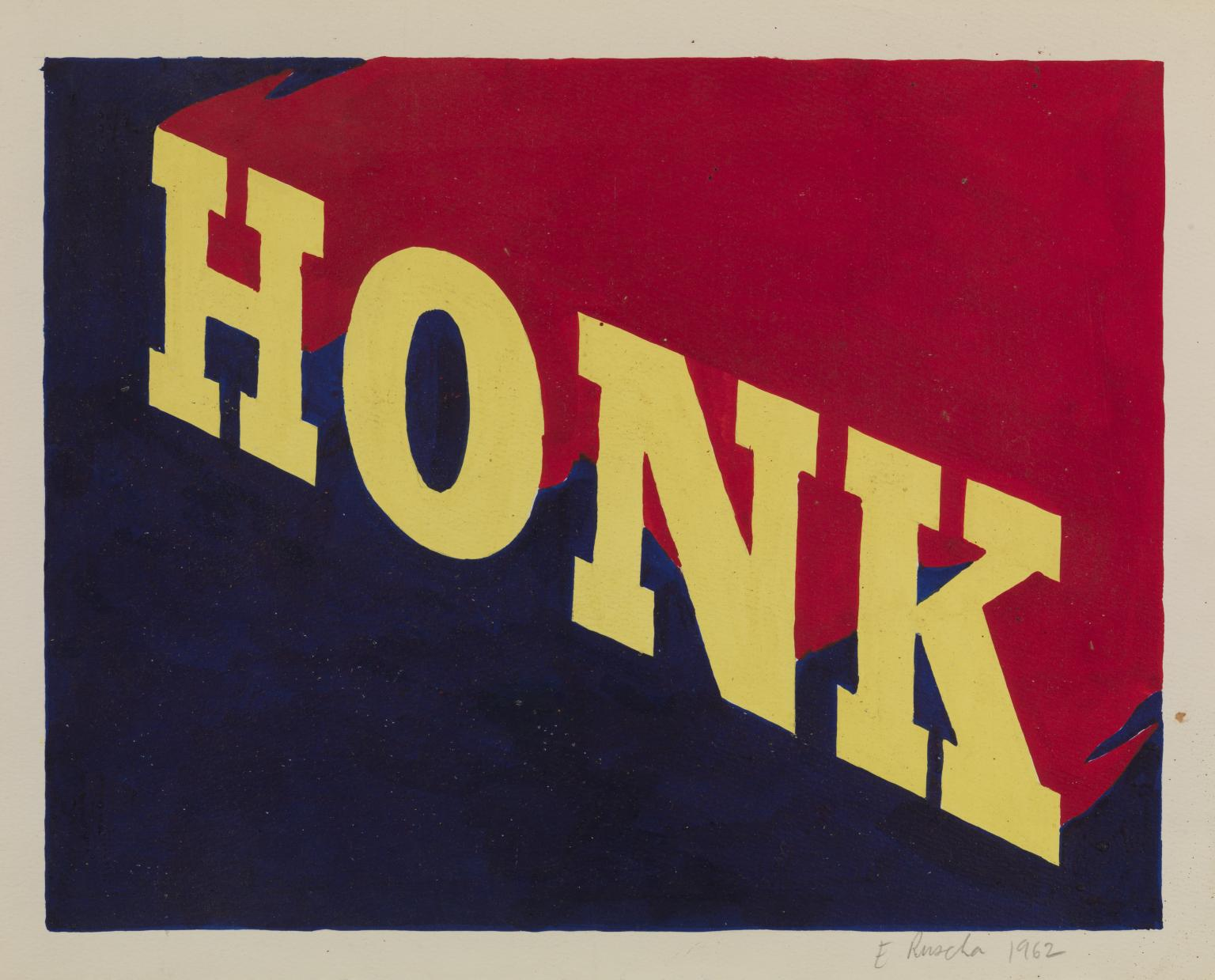
Ed Ruscha
Artist Ed Ruscha moved to California from Oklahoma to study art (under Robert Irwin, no less), and after graduating took a job in 1961 as a layout artist for the Carson-Roberts advertising agency in Los Angeles, where he learned lettering, advertising, and design. These dual educations laid the foundation for what would be a long tradition of text-based artists seizing the means of marketing.
One of the earliest examples of Ruscha’s newfound lettering skills put to use in art is Honk (1962).
Andy Warhol
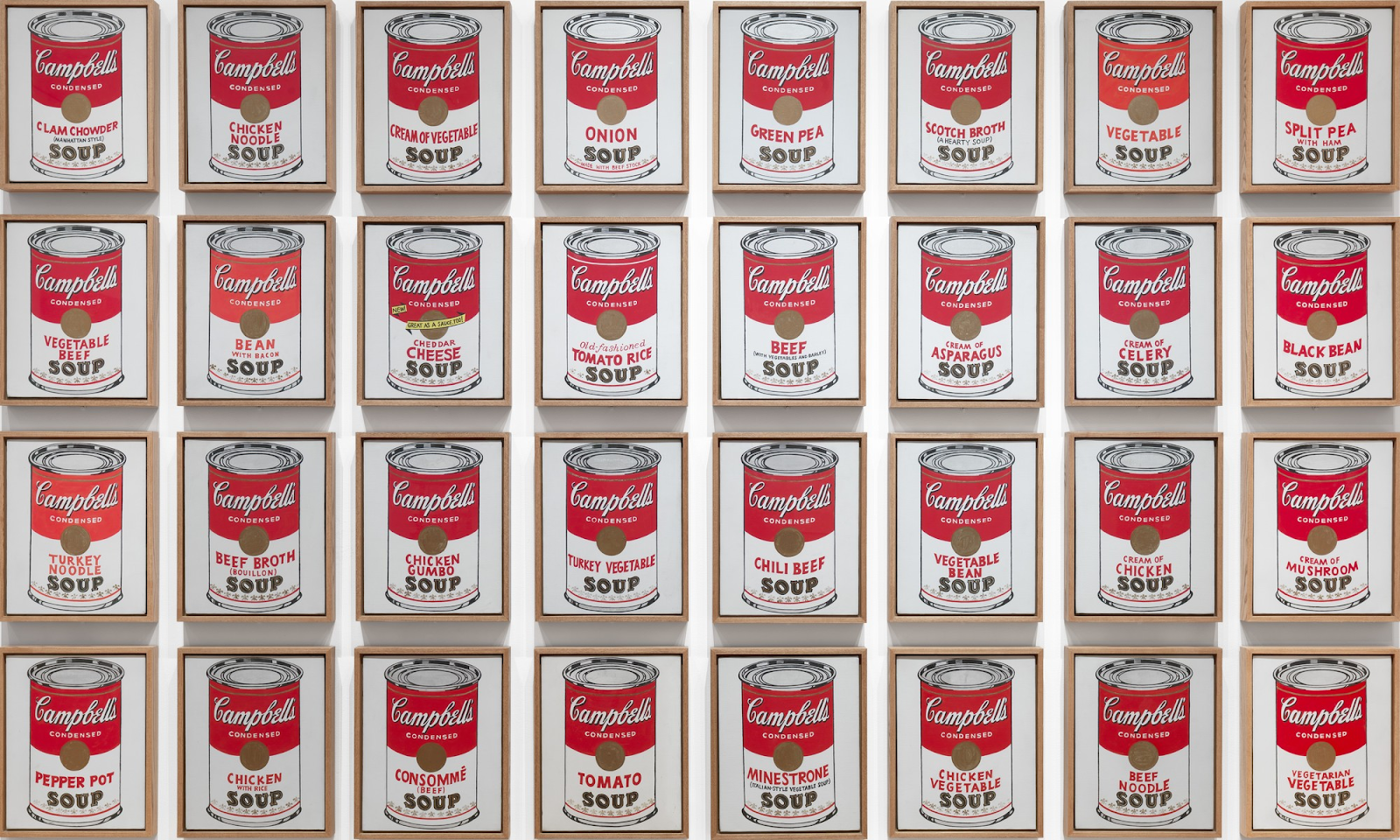
The same year, on the other side of the United States, Andy Warhol stole more liberally from the commercial world when he exhibited his infamous Campbell’s Soup Cans.
When asked about his choice to paint Campbell’s soup cans, Warhol replied, “I used to have the same lunch every day, for twenty years, I guess, the same thing over and over again.” This daily routine inspired a series of thirty-two canvases, each representing a different flavor available from Campbell’s at that time. Warhol employed techniques such as projection, tracing, painting, and stamping to create these works. By repeating the nearly identical image across all canvases, he highlighted the consistency and omnipresence of the product’s packaging, while also challenging the traditional notion of painting as a medium for innovation and originality.
Roy Lichtenstein
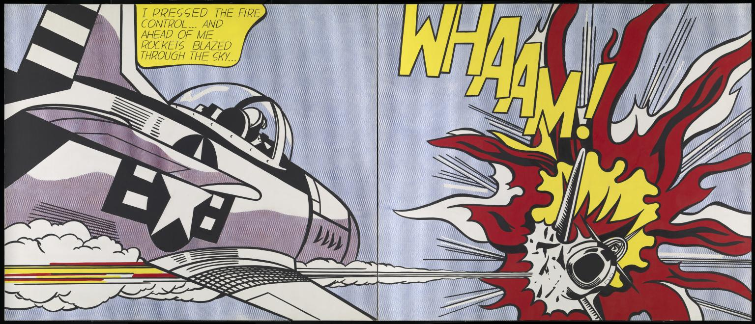
Where Ruscha cribbed from advertising and Warhol from branding, one of the earliest pieces of pop art, Roy Lichtenstein’s Whaam! (1963), drew inspiration from comic books, primarily from a panel illustrated by Irv Novick in a 1962 war comic. Lichtenstein reimagined the source material by presenting it as a diptych and altering the interplay between the graphical and narrative components.
Following the above examples, Andy Warhol released Brillo Boxes (1964), leading prominent art critic Arthur Danto to declare the end of art.
Joseph Kosuth
As Fluxus and conceptualism grew increasingly influential, especially in the New York scene, artists began to decouple the idea and the artwork. To perhaps oversimplify, the thinking was: If art is there to convey an idea, why not skip the art and just directly offer the idea?
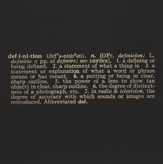
Sol LeWitt was one of the earliest artists to take this to its logical extreme by selling as art instructions for making the art. Other artists — many of them friends of LeWitt — went even more direct, such as Joseph Kosuth’s Titled (Art as Idea as Idea) The Word “Definition” (1966-68).
Kosuth stated that “art is making meaning,” and his work explores the relationship between art-making and language. This piece belongs to a series that uses definitions taken from dictionary entries of words such as “art,” “chair,” “meaning,” and, in this self-referential case, “definition.” For Kosuth, the actual artwork is the definition itself, but he requires that the original dictionary clipping be photographically enlarged to specific dimensions for display.
John Baldessari
John Baldessari began his artistic career in the 1950s as a painter but found his true calling in the 1960s with conceptual art. The burgeoning genre gave him room to explore new ideas and mediums, including photography, film, and text-based art.
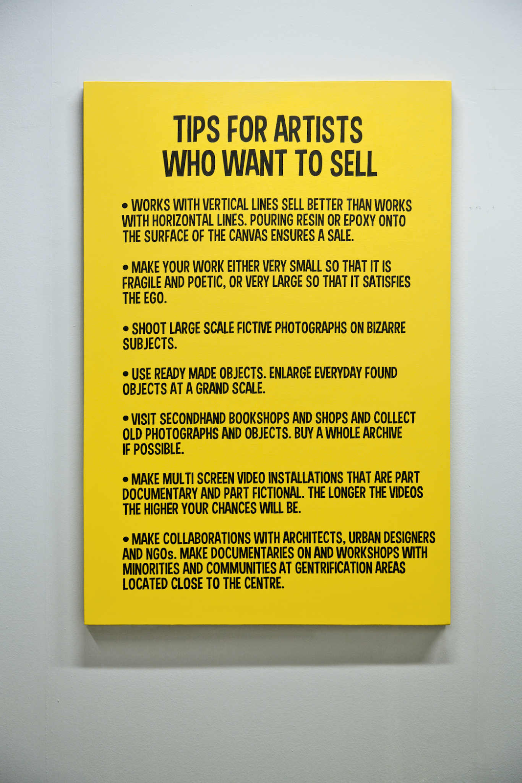
In 1966, Baldessari created Tips for Artists Who Want to Sell, a series of 14 prints that sardonically address the commercial aspects of art. The prints range from practical advice, like “Painting without pricing will be hard to sell,” to absurd statements such as “A baby one year old is a selling point always.” These guidelines, though whimsical, reflect the various facets of an artist’s experience in the commercial art world.
Baldessari’s humor highlights how even art, which aims to embody high ideals, is subject to commercialization and consumerism. Despite its playful tone, the series offers deep insights into the commodification of creativity, urging viewers to confront the reality that artists, like all professionals, must navigate the dynamics of supply and demand.
Lawrence Weiner
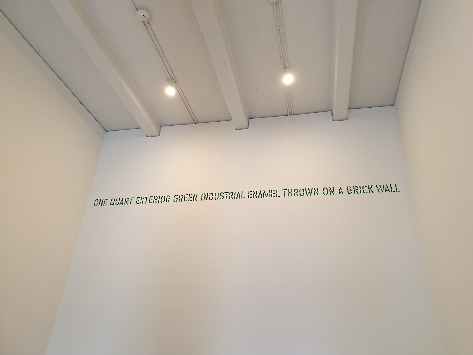
Lawrence Weiner’s ONE QUART EXTERIOR GREEN INDUSTRIAL ENAMEL THROWN ON A BRICK WALL (1968) written in green on a wall, is one of Weiner’s early text-based installations, a format he adopted predominantly from 1968 onwards. Many of his subsequent works, including this piece, reference specific materials or physical actions. By detailing the process behind the artwork, Weiner demystifies the concept of ‘art’ and ‘artists,’ suggesting that anyone could recreate this piece or produce something similar. This approach was part of his effort to democratize modern art.
Weiner later described his transition to using words as a form as “a political decision.” He explained that to create something universally accessible, he needed to imbue it with genuine sculptural values and present it in a language that allowed people to replicate it themselves. These were not instructions, but standalone pieces. According to his 1968 Declaration of Intent, these text-based works do not require the artist’s personal execution. Weiner views his text-based works as sculptural, listing the materials as “language + materials referred to.”
Robert Indiana
More literally sculptural is Robert Indiana’s most famous work, LOVE (1970), which became an immediate global icon.
While it’s easy to assume LOVE was inspired by romance or a fellow feeling, it was actually influenced by his religious upbringing in the Church of Christ, Scientist. The design started as a Christmas card to friends and grew from the phrase “God is Love” from his childhood church. Indiana later came to resent the success of this piece, which was far more successful than his wildest ambitions and came to mark him as something of a “one-hit wonder,” even if he’d never hoped for quite such a hit to start with.

Jenny Holzer
Jenny Holzer’s Truisms (1977–1979) are among her most recognized works, comprising nearly 300 aphorisms and slogans that utilize modern clichés or widely accepted truths.
In 1977, while studying literature and philosophy in New York City, Holzer began using words and language as standalone art mediums. She simplified complex ideas from her readings into brief, punchy statements and posted them around Manhattan. Unlike contemporaries who combined text with imagery, Holzer treated text as the primary visual element, valuing the immediacy and broad reach of signage.
Holzer wrote her own aphorisms, believing unconventional messages would be more memorable. She kept her statements brief to capture attention quickly, aiming for them to provoke thought, elicit laughter, and prompt reflection.

Jean-Michel Basquiat
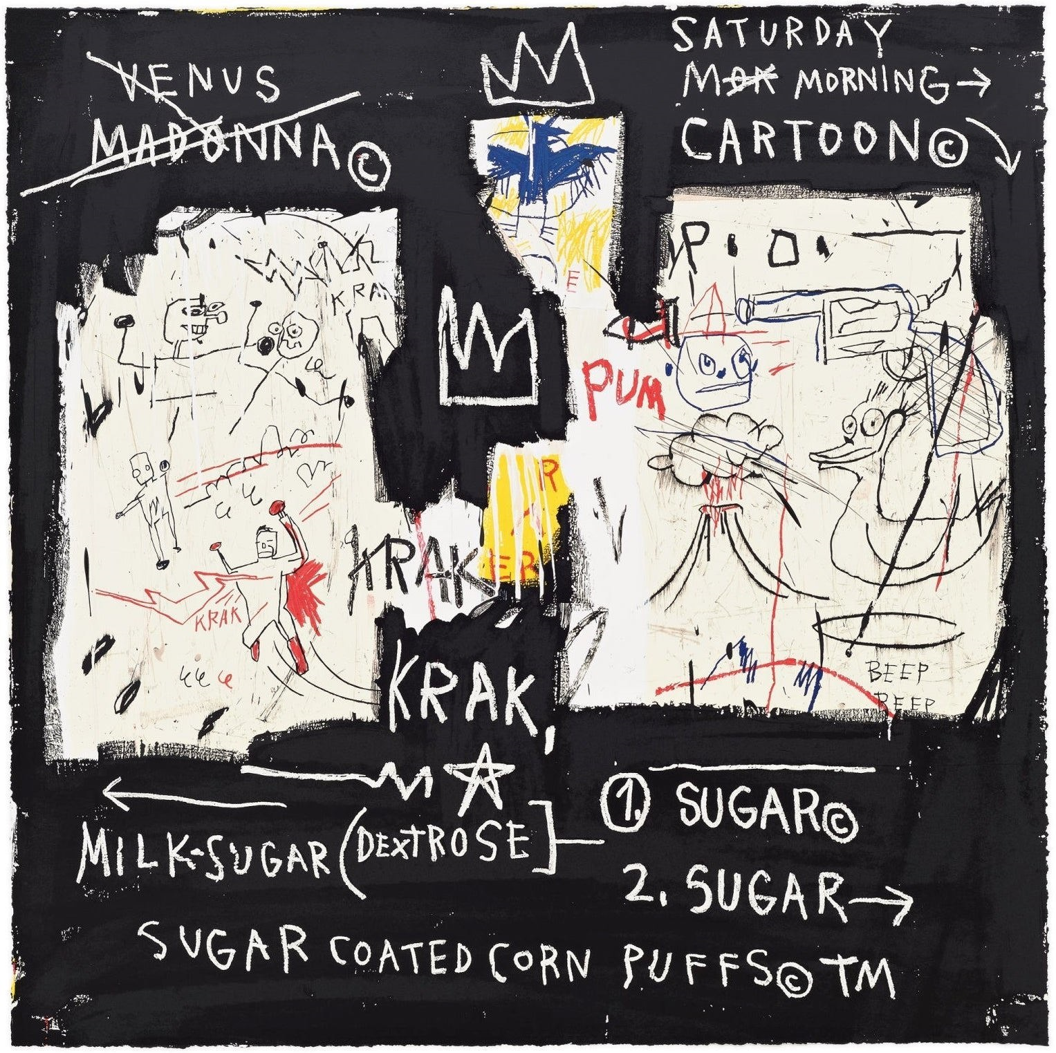
Jean-Michel Basquiat’s A Panel of Experts (1982) showcases his signature style of aggressive brushstrokes and fragmented anatomy, integrating text and poetry in a complex visual language.
The piece was inspired by an altercation between his lovers Suzanne Mallouk and Madonna. Prominent on the top left is the word “VENUS” (his nickname for Mallouk with “MADONNA©” crossed out beneath it. This crossing out of Madonna’s name draws attention to it, a technique Basquiat explained as a way to make obscured words more noticeable. The copyright symbol next to Madonna’s name hints at her future stardom. The central scene humorously depicts the fight between Mallouk and Madonna as stick figures, reflecting Basquiat’s playful narrative style.
Basquiat’s childhood aspiration to be a cartoonist is evident in the painting’s comic book elements. Below the depiction of the fight, a superman-like figure is shown with the word “KRAK,” reminiscent of comic book sound effects. The painting also includes references to Saturday morning cartoons, with phrases like “SATURDAY MORNING CARTOON,” “SUGAR COATED CORN PUFFS,” “MILK,” and “SUGAR” scattered across the canvas.
Bruce Naumann
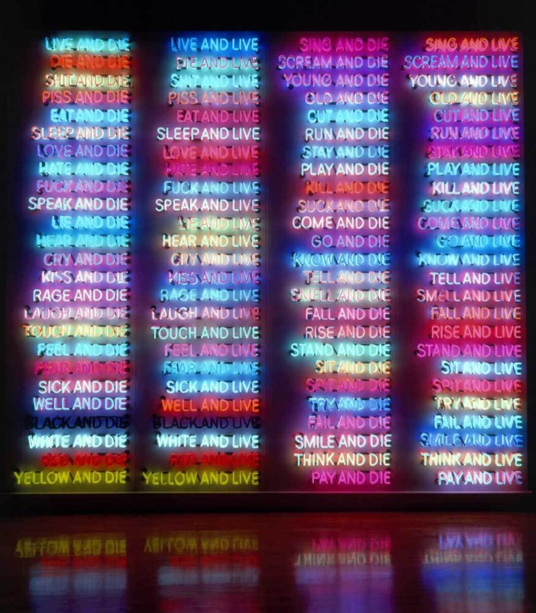
Bruce Nauman is an artist known for his work across various media, including sculpture, photography, neon, video, drawing, printmaking, and performance. His 1984 neon artwork One Hundred Live & Die consists of four columns with 100 words each, related to themes of life, death, emotions, and human actions. Each phrase in the artwork is made up of three words and ends with either “live” or “die,” such as “laugh and live” and “laugh and die.” The phrases light up in a specific sequence, creating a visual display that highlights Nauman’s interest in language and color.
The artwork includes thematic pairs like “love” and “hate” or “black” and “white,” as well as singular terms like “fear,” “kill,” “think,” and “pay,” which do not have direct opposites. This combination of repeated and unique terms provides a clear representation of human experiences, reflecting Nauman’s approach to combining wordplay with visual elements.
Christopher Wool
Christopher Wool’s word paintings emerged in the late ‘80s using pre-existing forms like blocky stencils. His fascination with how words change in form and function when integrated into the cityscape is exemplified by his replication of “SEX LUV” from a spray-painted delivery truck in a 1987 work on paper.
Apocalypse Now (1988), perhaps Wool’s most famous word painting, features the words “SELL THE HOUSE SELL THE CAR SELL THE KIDS” stenciled in black, block letters using alkyd enamel on an off-white aluminum and steel plate. The phrase is a quote from the 1979 film Apocalypse Now, written in a letter by a character who’s gone insane in the jungle. Further emphasizing a sort of manic panic, the disjointed words and lack of punctuation stall immediate comprehension, not unlike Wendy’s slow decoding of the word REDRUM as MURDER in The Shining.
Barbara Kruger
Barbara Kruger is renowned for her art that critiques media and politics using the language of tabloid sensationalism and direct authority. Her works blend the commercial and art worlds, effectively dismantling cultural hierarchies by suggesting that everyone and everything is commodified.
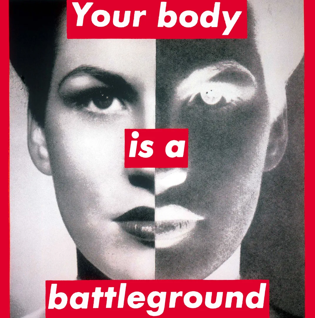
In 1989, amid protests against new anti-abortion laws that threatened to undermine the 1973 Roe v. Wade decision, Kruger created Untitled (Your body is a battleground) for the Women’s March on Washington. This piece, featuring a woman’s face split into positive and negative exposures and overlaid with text, serves as both art and protest highlighting the persistent division and debate over women’s autonomy.
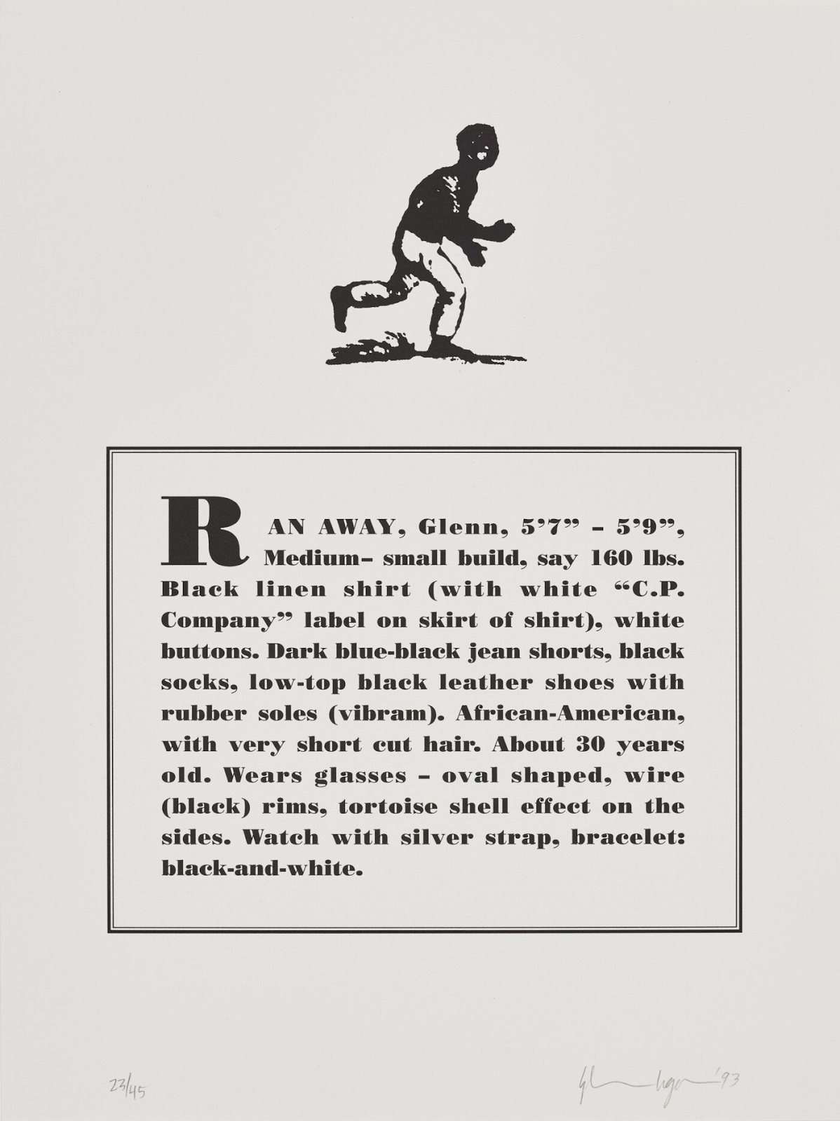
Glenn Ligon
American conceptual artist Glenn Ligon is known for his exploration of themes such as race, language, desire, sexuality, and identity. Based in New York City, Ligon’s work frequently references 20th-century literature and cultural figures, drawing on the words of James Baldwin, Zora Neale Hurston, Gertrude Stein, Jean Genet, and Richard Pryor.
Ligon’s 1993 series The Runaways comprises ten lithographs inspired by 19th-century advertisements placed by slave owners seeking escaped slaves. For this series, Ligon asked friends to write descriptions of him as if they were reporting a missing person to the police. He then rendered these descriptions in typography that mimicked the original ads, pairing them with illustrations from period newspapers and anti-slavery pamphlets.
The unsettling similarity between his friends’ descriptions and the historical slave ads highlights the enduring impact of racial profiling and the legacy of slavery in contemporary society. By positioning himself as the subject of these modern-day “runaway” ads, Ligon creates a powerful commentary on identity, historical context, and the dehumanizing effects of systemic racism.
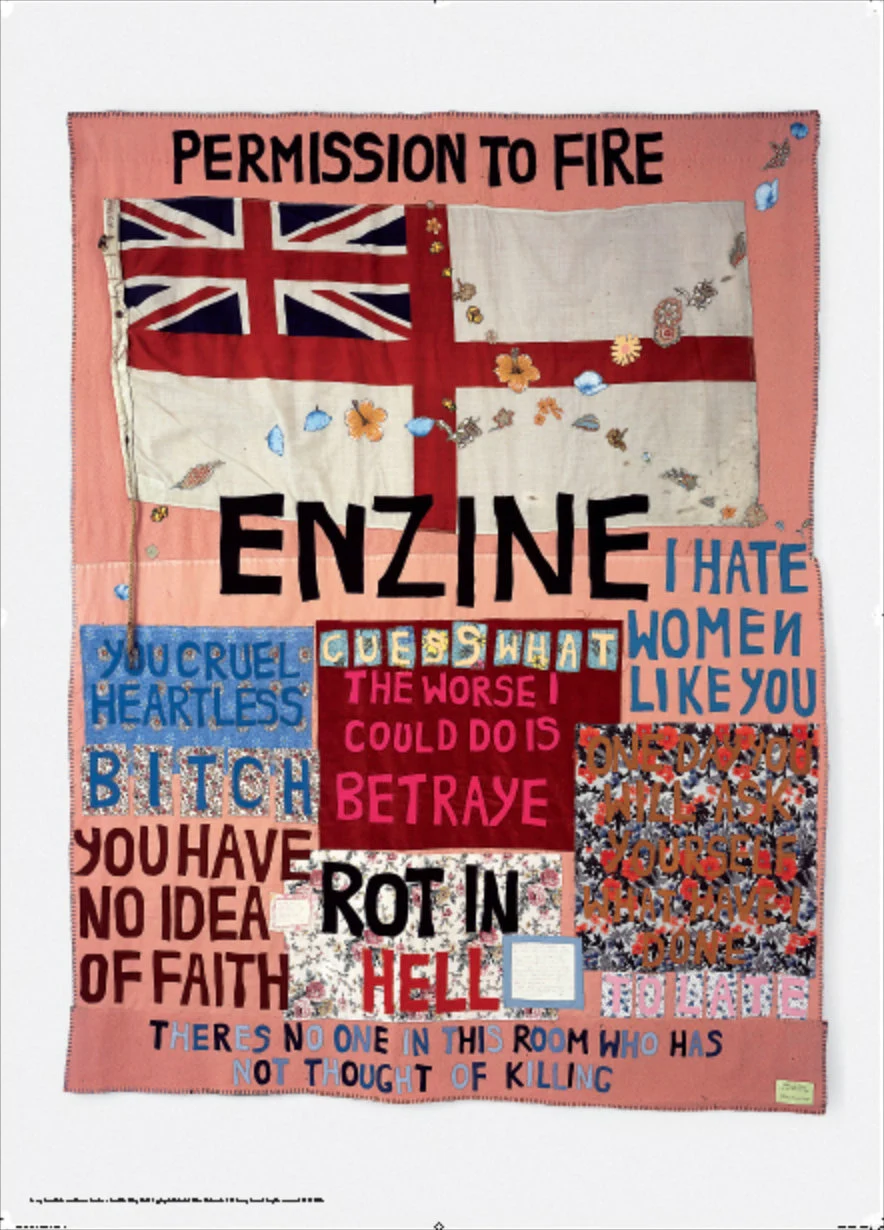
Tracey Emin
Tracey Emin’s Hate and Power Can be a Terrible Thing (2004) exemplifies the artist’s radical approach to text art through the medium of stitched quilts. In this work, Emin juxtaposes powerful and provocative statements like “I hate women like you” and “You have no idea of faith” with the traditionally domestic activity of quilting, creating a stark contrast that emphasizes the intimate and confessional nature of her words. The inclusion of spelling mistakes adds to the crude, handmade quality, further underlining the personal and diaristic tone of the piece. Emin uses an old pink blanket, floral fabrics, a soiled flag, and felt lettering, all roughly stitched together, transforming a symbol of domestic comfort into a vehicle for enraged self-expression and political condemnation.
The artwork explicitly references the Falklands War and Margaret Thatcher, with phrases like “ROT IN HELL” and “YOU CRUEL HEARTLESS BITCH,” making Emin’s denunciation of Thatcher and the war unmistakable. The British ensign and the words “PERMISSION TO FIRE” underscore this critique, while the appliquéd flowers and cross add layers of symbolism.
Kay Rosen
The work of Kay Rosen splits the difference between visual pun and linguistic pun to communicate messages more succinctly than could’ve otherwise been dreamt possible. For over 50 years, Rosen has explored the possibilities of words as images, delighting in small shifts and subtle changes that subvert meaning and reveal the unexpected. Her diverse body of work—including paintings, drawings, wall works, collages, and editions—employs varied visual, grammatical, and typographical strategies to challenge how people perceive and understand words. Rosen’s use of color articulates her ideas in ways that are often humorous, sometimes shocking, and frequently profound.
Rosen’s work has been described as sculpture, poetry, architecture, and performance, earning her accolades such as being called a “writer’s sculptor” by Roberta Smith of the New York Times and the “poet of the art world” by Eileen Myles.

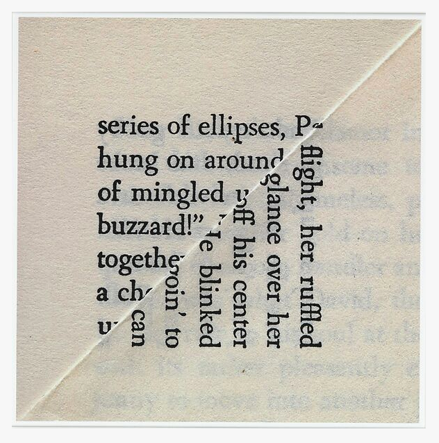
Erica Baum
Erica Baum, an American photographer based in New York City, is celebrated for her innovative use of printed paper and language in her work. In her Dog Ear series (2009–2010), Baum photographs dog-eared pages of mass-market paperbacks, capturing the small diagonally bisected squares or rectangles of text created by turning down a page corner. This simple yet evocative concept transforms the act of marking one’s place into a reflection on collective historical memory, with the resulting images creating readymade poetry that can be interpreted in multiple ways.
The photographs, formally neutral and reminiscent of Josef Albers’ Homage to the Square, draw viewers in with their subtle interplay of verbal and visual signs, prompting questions about whether to view them as artistic photographs, documentation, or text art. Through this blend of chance and intention, Baum’s work challenges and engages the viewer on multiple levels.
Conclusion
Despite the ridiculous length of this article, we’ve so far barely scratched the surface of text-based art and its many practitioners. We will likely write a followup highlighting many of the great text artists who’ve debuted upon the art scene in the 21st century, including those occupying web3, but for now, consider this part one.
For updates on all of our upcoming editorial features and artist interviews, subscribe to our newsletter below.